Blood, Sweat, and Style Tiles: A Statebook Revamp
How style tiles can speed up your design process.


Screenshot of the old Statebook.com home page.
StateBook provides comprehensive economic market data for every community in the U.S. Earlier this year, their team came to Limina with a design problem. Their goal was to reposition their offering and their brand through a home page redesign. They had a strong grasp of the content and communication goals for a new home page, but only a basic idea of how to attack the design. The project was narrow on both scope and time; they needed a partner to bring their new vision to life, and they needed it yesterday.
Rapid Planning and a side of Style Tiles
With business goals in hand, our team came together in front of the whiteboard and traced the content goals of the page from top to bottom. We looked to other sites for layout and design inspiration, including a shortlist of websites the Statebook team liked.
To kickstart the visual design we started with the basics. In order to get the general look and feel agreed upon, we created two style tiles that included color palettes, fonts, and user interface (UI) stylistic choices to give Statebook a choice in visual direction. These relied on inputs from the current brand but allowed for an expansion into other colors, fonts, and styles to modernize Statebook’s digital presence.
Ellie, fellow Limina designer, and I created distinct, yet cohesive options for Statebook to evolve the current brand. In our initial review, the team liked elements of both style tiles, resulting in a hybrid visual direction for the mockups.'

My style tile concept for the Statebook refresh.

Statebook refresh side by side with the style tile options.
What's a Style Tile?
In web design, a style tile is a tool to help designers communicate a visual style direction by bringing a few foundational web elements together. Typically those elements include:
The color palette, identifying primary colors, secondary colors, and any additional color dimensions.
Typography structure, including examples like headlines, body copy, and labels.
Sample user interface elements, like buttons, cards, form fields, and iconography.
Style tiles have been described as the intermediary step between a mood board and a full-on detailed mockup. They allow designers to get feedback and stakeholder buy-in on a visual system earlier in the review cycle before too much time has been invested in visual composites.
Collaboration for the Win

Example feedback comment from the InVision prototype.
With the hybrid style in mind, and with some of the UI elements fully agreed upon from the very beginning, visual composites (also known as comps) came together extremely quickly. This was also due to our team’s choices in collaboration tools. The style tiles were created in Figma. As we moved into the composite stage, we stayed within Figma which allowed us to quickly move from the tile to the comp, grabbing our styles and implementing them on the page. Many times we found ourselves sitting together–sometimes even silently–on a Slack call as we watched each other work together live on the same page.
That collaboration didn’t just occur internally, but with Statebook as well. We allowed the Statebook team to provide comments on an InVision prototype for quick back and forth commentary on content and layout.
More than just a Pretty Comp
With only minor edits and content updates in the initial review, the second and final iteration of the home page design fully captured the content goals for Statebook’s new digital face.
Along with the composite, Jon Fukuda plugged away on the front-end to hand off to Statebook IT. Because there was visual styling consensus early on in the project through the style tiles, he was able to craft the CSS, page layouts, and component styling before the designs were fully finished and approved. This was invaluable when it came to finessing the responsive mobile views of the home page; instead of mocking up the mobile version of the page, we tweaked live code on the fly.

From start to delivery, the team executed this project within a few weeks. Statebook was ecstatic with the outcome. While this effort was localized to the home page, Statebook’s IT team has been slowly implementing complementary styles on their existing pages throughout their system, and even on their product’s platform.
The Limina team has been so happy to be partnering with the Statebook team on their new home page launch, and look forward to helping them more in their future endeavors

Siteworx Design Co-hosts a Screening of Design Disruptors
Recap: A screening of Design Disruptors, a documentary film produced by InVision.

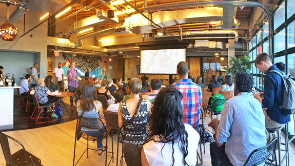
On August 11th, Siteworx co-hosted a screening of Design Disruptors, a documentary film produced by InVision. Design is at the forefront of every business, now more than ever, and InVision’s film set forth to provide a look into how the leaders of design are “disrupting” billion dollar industries daily. Siteworx and Brllnt worked together to host the screening at the Wonderbread Factory in DC. Designers from WeWork and across the DC area gathered together to think critically about their craft, view the film, and of course, eat delicious popcorn.

The crowd gathers to watch "Design Disruptors" at the WeWork Wonder Bread Factory.
Before the screening began, our DC design team mingled with the gathering audience. The crowd consisted of other eager designers and UX gurus, many of whom were attracted to the event to see what InVision’s production was all about.
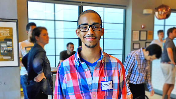
Corey Jones
Corey Jones was one such attendee. He works as an Art Director at Forum One, a digital agency located locally in Alexandria, VA that focuses on the non-profit space. He was specifically attracted to the event because he and his team work daily with InVision. “We use InVision all the time, I actually introduced it to our company, and we’ve adopted it into our workflow […] We saw the advertisements for [the film] and we decided it was a great thing for our company to come out and to view and actually see how these other companies are using InVision and being productive design agencies."

Sabrina Ritacco (left) and Vianka Aloras (right)
Vianka Aloras and Sabrina Ritacco were also excited to be part of the screening event. Both are recent graduates of General Assembly’s User Experience program, and are passionate about the design community and the design process. Vianka said, “I’ve come to the event to hang out with more design oriented people, to network with the DC area, and to check out the documentary." Sabrina continued, “This felt really different. I feel like a lot of times you go to these meet ups to talk to people, but […] the trailer gave me goose bumps, it feels exciting. I feel like it has built excitement within the community that is cool to share."
Please stop reading now if you hate spoilers! If you like spoilers, or have seen the film, proceed at will.
"Everything is designed. Few things are designed well.”
–Brian Reed
Design Disruptors is a beautifully crafted film. The documentary begins by laying out the design scene at various top tier companies and agencies. We are brought behind closed doors into inspiring spaces where incredible design teams work daily to innovate on and evolve their products. We hear from designers at Lyft, Google, Netflix, Airbnb, and Dropbox, just to name a few. All share their passion for user-driven design intertwined with business strategies.
The film focuses on the definition of design - it must make sense, it must be functional, and it must meet the needs of the user. Well-designed user-centric products make users happy (whether consciously or not), and ultimately make businesses stronger. Teams that adapt to navigate disruptive moments in history have and continue to create great things. Businesses that allow the design to flourish win in the end.
“It takes monumental improvement for us to change how we live our lives. Design is the way we access that improvement.”
–Mike Davidson
All in all, the film is a great overview of the design field. It not only reveals how product designers create their work day-to-day, but also reminds us why they became designers in the first place through inspirational quotes and nostalgic peeks into the past. While the film didn’t dive as deeply as I would have liked into the nitty gritty details of any specific product, objective, or industry, it was inspiring to see how many product companies have placed design at a higher level of priority for their business. It was also refreshing to hear designers' share their desire to create a positive impact in their users’ lives by crafting the best product they could.
After the credits started rolling, I found my new friends Corey, Vianka, and Sabrina. I was curious to hear what aspects of the documentary spoke most to them, which ideas resonated with their day-to-day design lives, and how they would in turn describe the film in their own words.
Corey found common ground in both his take on the design field and his day-to-day job. “For me, design has always been about solving problems. Just because you haven’t seen it done before doesn’t mean you can’t do it. I try to practice that in my design every day at Forum One.” He continued, "It was actually kind of refreshing to see that we are already doing similar things as what a lot of the other companies were talking about, even though they are such different organizations than ours. And I think it’s just because designers tend to think alike and they want to do these things naturally and try new things."
Vianka, who is passionate about user experience design, brought it back to the users. “It comes down to the users, so the people. It is about being in tune with who you are designing for, which is crucial. I see day to day that that is the number one thing that should be top of mind. You are designing for others, not yourself, not even your team; it’s for those that will be using your product."
Sabrina boiled the film down to change. “Design supports change. Evolution. These changes are going to happen and design is right alongside of those things, making it happening."